

This article started somewhere I wasn’t expecting. And yes… it’s a long one! But bear with me, it’s worth the journey. I started with a simple question about a few unusual spikes in some data, and somehow ended up building five reusable statistical UDFs for Power BI.
So how did it start?
Not long ago, I attended Turn Data and AI Into Stories People Actually Remember, where one of the hands-on activities involved exploring a World Health Statistics dataset. Rather than analysing the whole world, I naturally gravitated towards Latin America and the Caribbean, partly because that’s the region I know best.
As I explored mortality rates between 1960 and 2015, most countries followed a remarkably similar pattern. Mortality gradually declined over the decades, with only small year-to-year fluctuations. However, four countries immediately stood out. Haiti, Nicaragua, Honduras and Venezuela each showed a sudden spike before returning almost immediately to their long-term trend (See Figure 1). It didn’t look like poor-quality data or a reporting issue. It looked like something significant had happened.

Haiti caught my attention first because the spike in 2010 was by far the largest. Growing up in Brazil, I remembered watching extensive news coverage about Brazil sending humanitarian aid to Haiti, although I couldn’t quite remember what had triggered such a large international response. After a quick search, I rediscovered the devastating earthquake that struck Haiti in 2010. Curious to see whether the other spikes also corresponded to real-world events, I searched for those years as well. Nicaragua and Honduras both aligned with Hurricane Mitch in 1998, while Venezuela’s spike coincided with the Vargas tragedy in 1999.
Finding four unusual jumps that all corresponded with major natural disasters immediately raised another question. Was I simply recognising patterns because I already knew the historical events, or were these changes genuinely unusual from a statistical perspective? In other words, could I demonstrate mathematically that these spikes were significantly different from the normal year-on-year variation for each country?
That distinction turns out to be more important than it first appears.
Traditional outlier detection asks a fairly simple question: is this value unusual compared to the rest of the data? But that wasn’t really the question I wanted answered.
What I actually cared about was whether the change itself was unusual. Rather than asking whether the mortality rate in 2010 was exceptionally high, I wanted to know whether the increase from one year to the next was larger than would normally be expected for that country.
The difference might sound subtle, but it completely changes how you approach the analysis.
Five Ways to Test a Change
For this dataset, I didn’t start with a catalogue of statistical tests. I started with a Z-score on the year-on-year differences, because I needed something fast and interpretable that worked at country level in Power BI.
That alone was enough to surface the four spikes I had already noticed visually.
Once the Z-score was working, I got curious about what other methods existed for identifying unusual changes. I started exploring other statistical tests and how they could be represented as reusable UDF-style calculations.
Across all of them, the core idea stays the same: we are no longer testing whether a value is unusual, but whether the change between values is unusual.
1. Z-Score (On the Differences)
This is the method I actually used in the mortality dataset.
Instead of comparing each value to a global average, it measures how extreme each year-on-year change is compared to that country’s own typical volatility.
Each spike is therefore assessed within the context of its own historical variation rather than against other countries or a global benchmark.
The maths:
| z = (Δx − μΔ) / σΔ |
Where:
- Δx is the year-on-year change
- μΔ is the mean of all year-on-year changes for that country
- σΔ is the standard deviation of those changes
A common rule of thumb flags anything where |z| > 3.
The limitation:
It assumes the changes follow an approximately normal distribution. It is also sensitive to extreme values, since a single large spike can influence both the mean and the standard deviation of the series.
2. IQR (Interquartile Range) Method
This method does not rely on any assumption about distribution shape. It uses the spread of the middle 50% of the data to define what is typical.
It answers the question: what range of change is expected for this country, and what sits outside it?
The maths:
| IQR = Q3 − Q1 Lower bound = Q1 − k × IQR Upper bound = Q3 + k × IQR |
Where:
- Q1 is the 25th percentile of year-on-year changes
- Q3 is the 75th percentile
- k is usually 1.5 (or 3 for stricter detection)
A change is flagged if it falls outside these bounds.
The limitation:
With relatively small time series (around 54 observations per country in this case), percentile estimates can be unstable, and normal variation may occasionally be flagged as anomalous.
3. Modified Z-Score (Median Absolute Deviation)
This method follows the same structure as a Z-score but uses the median and median absolute deviation instead of the mean and standard deviation.
It is designed to reduce the influence of extreme values in the baseline calculation.
The maths:
| MAD = median(|Δxi − median(Δx)|) M = 0.6745 × (Δx − median(Δx)) / MAD |
A common threshold is |M| > 3.5. The constant 0.6745 aligns MAD with standard deviation under a normal distribution.
The limitation:
It is more robust to extreme values, but less straightforward to interpret compared to mean-based methods.
4. Grubbs’ Test (On the Differences)
This is a formal statistical test designed to identify a single outlier in a dataset that is assumed to follow a normal distribution.
It extends the Z-score approach by comparing the most extreme observation against a statistically derived threshold.
The maths:
| G = |Δx − mean(Δ)| / stddev(Δ) Gcritical = ((N − 1) / √N) × √( t² / (N − 2 + t²) ) |
Where:
- N is the number of year-on-year changes
- t is the critical value from the t-distribution at significance level α/(2N)
A change is flagged if G > Gcritical.
The limitation:
It assumes normality and is designed to detect a single outlier at a time, which reduces its effectiveness when multiple anomalies exist in the same series.
5. Gaussian (Normal Distribution) Probability
This method reframes the problem in terms of probability rather than distance.
Instead of asking whether a change is unusual, it estimates how likely it is to observe a change of that magnitude under a normal distribution.
The maths:
| f(Δx) = 1 / (σΔ√(2π)) × e^(-(Δx−μΔ)² / (2σΔ²)) p = 2 × (1 − Φ(|z|)) |
Where:
- Φ is the cumulative distribution function of the normal distribution
- z is the Z-score of the change
A small p-value (commonly < 0.05) indicates the change is unlikely under the assumed distribution.
The limitation:
It still depends on the assumption of normality. With relatively small sample sizes per country, tail probability estimates can become unstable, particularly for extreme values.
Running These Natively in Power BI
As Power BI supports User-Defined Functions (UDFs), there is a different way to approach this. Instead of retyping the same statistical formula across a dozen measures, the logic can be defined once and reused wherever it is needed.
That becomes particularly useful here because all of these methods follow the same structure: they take a year-on-year change, compare it against the distribution of changes for that country, and return a signal when something falls outside what is expected.
A quick but important note before the code: every _X parameter below represents a year-on-year change, not a raw value from the dataset. The calculation always starts by deriving the difference first (this year’s mortality rate minus last year’s), and only then passing that result into the function, along with the mean and standard deviation of all year-on-year changes for that country. That separation is what keeps the analysis focused on change, rather than traditional outlier detection on raw values.
You will also notice that every parameter and internal variable is prefixed with an underscore (_X, _Mean, _Median, and so on). This is not just a naming choice. Several common terms are already reserved in DAX, including words like VALUE and MEDIAN, which map directly to built-in functions. Using a consistent prefix avoids naming conflicts and reduces the risk of clashes as the language evolves.
One additional safeguard sits inside every function: a check for blank inputs. If _X is blank, the function returns BLANK() immediately and skips any calculation. This matters because the first period in any time series has no previous value to compare against, so the year-on-year change is undefined. Without this check, DAX can still evaluate expressions in ways that treat blanks like zero, which would incorrectly produce a valid result for that first period and potentially flag it as an anomaly even though no comparison exists.
All the UDFs are on this txt file
1. Z-Score
Nothing extra to flag here beyond the general notes above. The threshold rule of thumb is |z| > 3.
2. IQR Method
Note that _Multiplier defaults to the standard 1.5, but you can pass 3 for a stricter “extreme” cut.
3. Modified Z-Score
Note that for Modified Z-Score, 0.6745 is the standard constant that makes MAD comparable to a normal distribution’s standard deviation.
4. Grubbs’ Test
Note that this one is genuinely two functions, since the critical value depends on sample size, not just the change itself. IsGrubbsOutlier nests the other two, the same pattern Microsoft uses in its own UDF documentation. It doesn’t need its own ISBLANK check on _X directly, it just checks whether _G already came back blank, since GrubbsStatistic handles that.
5. Gaussian Probability
Note that NormalPDF gives you the height of the bell curve at that change, handy if you want to plot the distribution of changes itself. NormalTailProbability is the number worth quoting to a room, an actual two-tailed p-value, not just a z-score.
6. Helper functions: FlaggedPeriods and FlaggedValue
Two more functions, not one of the five statistical tests, but genuinely part of the model. Every test above answers “was this period flagged?” one row at a time. These two turn that into report-ready shapes: a card-friendly list of which periods were flagged, and a table-friendly score that only shows up on the rows that matter.
Note that both of FlaggedValue’s parameters use MEASUREREF, which only accepts a bare measure reference, not a computed expression. Passing GrubbsStatistic(…) directly as _ValueMeasure raises “An invalid argument type was passed into parameter ‘_ValueMeasure’. Expected ‘MEASUREREF’ but got ‘SCALAR’.” The three tests whose score already lives in its own saved measure (Z-Score, IQR, Modified Z-Score) work through FlaggedValue without issue. Grubbs and Gaussian, whose scores are computed live via a function call rather than stored as their own measure, need to be written directly instead, more on that trade-off in the lessons section further down.
Wiring the UDFs into Measures
With the statistical UDFs defined, the next step is connecting them to real data. This is where Power BI’s filter context becomes essential, because none of these methods operate on static values, they only make sense when evaluated within a specific slice of the model.
Here’s the pattern I use, split into two layers on purpose.
Layer 1: Contains the statistical foundation: measures for mean change, standard deviation, median, MAD, quartiles, and sample size. Each one describes what “normal” looks like for whatever the current filter context is, a country, a region, a product line, or any other slice of the data.
Layer 2: Contains the tests themselves. Each test is intentionally minimal: a single line that passes the current change and the relevant baseline statistics into its UDF. No repeated logic, no embedded VAR chains, no duplication of statistical rules. Just the value, the baseline, and the test.
That separation also makes the model easier to interrogate. Each statistical component can be dropped into a visual on its own, rather than being hidden inside longer expressions.
Before looking at the measures, there is one important structural note: all placeholders (<<BaseMeasure>>, <<DateTable>>, <<DateColumn>>) must be replaced with the actual model names before use.
Foundation
Every measure below depends on this one, so it needs to exist first. The blank guard is essential here. Without it, the first period in a series would incorrectly evaluate as a valid change, because DAX does not naturally propagate blanks through subtraction in a safe way.
-- This period's value minus the same measure one period earlier.-- Blank if there's no prior period, rather than letting DAX coerce-- a missing prior value to zero and return the base measure itself.Period Change = VAR _CurrentPeriod = SELECTEDVALUE ( <<DateTable>>[<<DateColumn>>] )VAR _PreviousValue = CALCULATE ( <<BaseMeasure>>, FILTER ( ALL ( <<DateTable>> ), <<DateTable>>[<<DateColumn>>] = _CurrentPeriod - 1 ) )RETURN IF ( ISBLANK ( _PreviousValue ), BLANK (), <<BaseMeasure>> - _PreviousValue )
Two Baseline Variants (Not Interchangeable)
At this point, the model starts to diverge slightly depending on the test being used. This is one of the few places where strict reuse breaks down, not because of inefficiency, but because the statistical assumptions behind each method are different.
Using the wrong baseline does not break the model. It simply changes what “normal” means.
Include-Everything Baseline
In this version, the current period is included in the baseline calculation. This aligns with methods like Grubbs’ test and the Gaussian approach, where the full distribution is part of the definition. Measures are listed on the file below.
Leave-One-Out Baseline
This version excludes the current period from its own reference distribution. It is used specifically for the recommended Z-score approach, to avoid the value under test influencing the baseline it is being compared against.
Test Measures
Once the baselines are in place, each statistical test becomes a simple application of them.
IQR and Modified Z-Score calculate their own internal statistics because those values are not reused elsewhere. Grubbs and Gaussian recompute their mean and standard deviation inline within these test measures too, rather than referencing the shared Mean/StdDev Period Change measures above, those shared measures are reused a little further down instead, by the Grubbs and Gaussian score measures in the next section.
The structure stays consistent: take the current change, compare it to a defined baseline, and return either a score or a classification. All measures are listed on the file below.
Flagging the Years That Matter, Without Scanning Fifty-Five of Them
A score sitting in a matrix next to fifty-five years per country is not something that gets read in practice. It gets visually scanned, then ignored. Once each test produces a working score, the next problem is no longer calculation, but retrieval: how to surface only the few rows where that score actually indicates something meaningful, without manually filtering visuals every time the report is opened.
The solution sits in a simple separation of concerns.
Each test is split into three parts:
- a raw score measure (the numeric output of the UDF)
- a companion measure that identifies which years are flagged
- a second companion measure that only displays the score when a flag exists
Individually, none of these are complex. Together, they change how the output behaves in a report. The score becomes inspectable, the flagged years become readable, and the noise disappears from the main visual surface.
Instead of forcing interpretation across every row, the model only exposes the moments where something has already been classified as unusual.
The Plain Score, One Per Test
Each of these measures calls its corresponding UDF directly and returns the calculated value for whatever year and country is currently in filter context. No flags, no conditional logic, no additional wrapping. All measures are listed on the file below.
IQR doesn’t have a companion “value output” in the same way the other tests do.
IsIQROutlier was never designed to return a magnitude. It is a boundary check by design: the result is either inside the expected range or outside it, with no meaningful notion of “how far” beyond the boundary a value sits.
Because of that, there is no secondary numeric layer to extract for IQR in the same way there is for Z-score or Gaussian probability. When a value is needed alongside the flag, the correct reference is simply the raw year-on-year change itself, since that is the exact input being evaluated against the bounds.
The five “Is … Outlier” flags called below are the plain-named equivalents of Change Is Z-Score Outlier, Change Is IQR Outlier, Change Is Modified Z-Score Outlier, Change Is Grubbs Outlier, and Change Is Gaussian Outlier from the previous section, built the same way, just without the generic Change prefix, since these are wired to the real model rather than a placeholder one. These measures are listed on the file below.
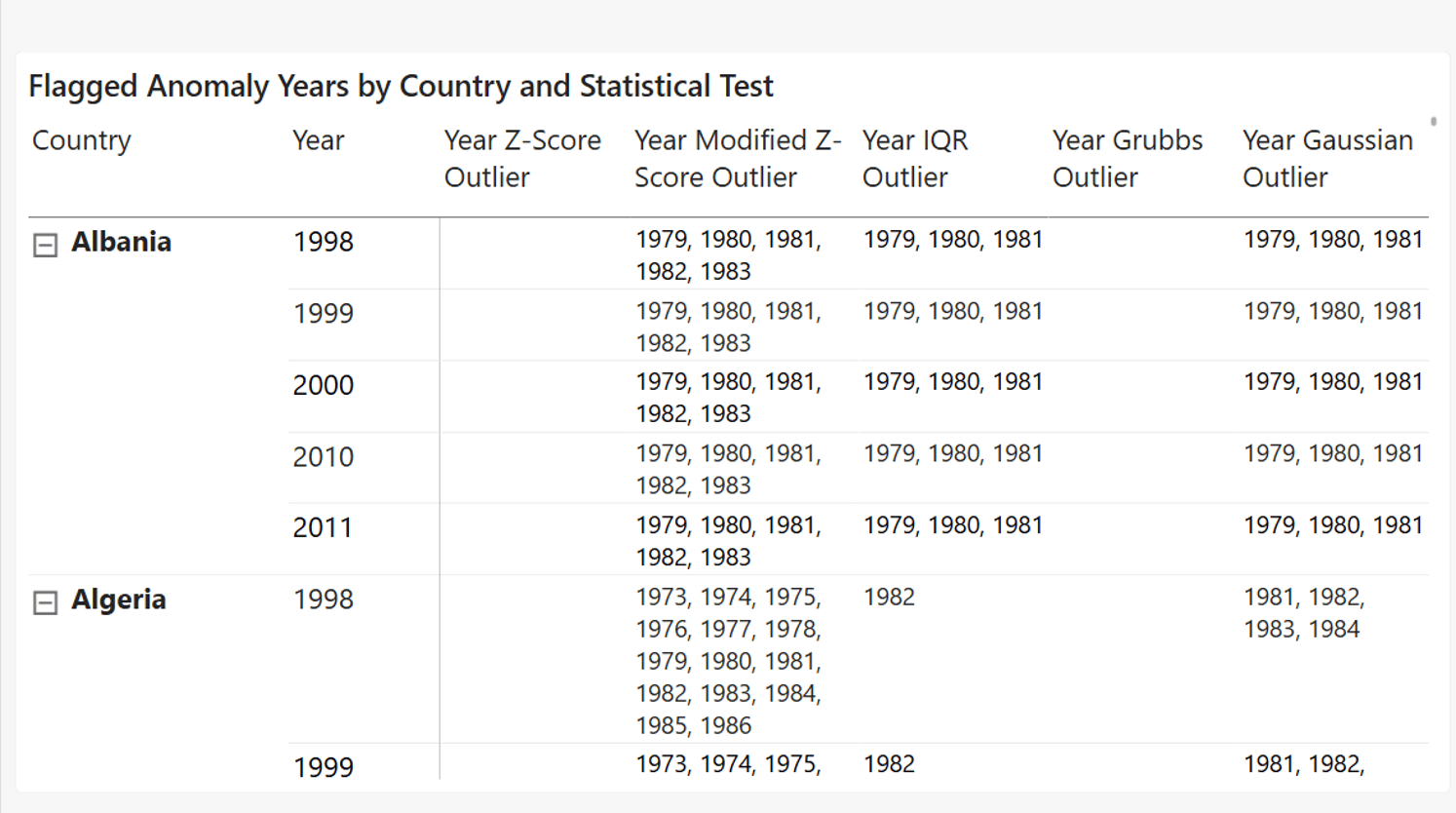
By placing the five “Year” anomaly flag measures into a matrix with Country and Year as the rows, we can immediately see which years each statistical test marks as unusual for the selected country. See the example below.
Try It Yourself: The Full Report, Ready to Explore
I created a two-page Power BI report to bring all of this together in a way that makes the results easier to explore and compare.
Anomaly Years presents a Country × Year matrix with each statistical test shown side by side. It gives a complete view of the dataset across time, making it possible to see how each method responds to the same patterns, year after year. The trade-off is density: every year is included, whether something unusual happens or not.
Anomaly Values focuses on the opposite perspective. Using Country, Region, and Year slicers, it filters the model down to only the rows where at least one test identifies an anomaly. Instead of working through the full historical series, the view surfaces only the points that have been classified as unusual, with each test’s output shown only where it applies.
Together, these two pages provide two complementary ways of reading the same model: one that preserves the full context, and one that isolates the signal.
The Power BI file is available to download below if you want to explore the report and see how the measures behave in practice.
The UDFs, measures and PBIX file are also available on my GitHub repository UDFs-significant-change.
Wrap-Up
What started as an afternoon learning about data storytelling turned into something I didn’t expect: a genuine statistics project, built entirely inside Power BI.
I didn’t set out to build five outlier detection tests or a small library of DAX functions. I set out to figure out whether four spikes I’d noticed by eye were actually significant, or whether I was just pattern-matching against events I already knew about. That single question, “is this real, or am I seeing what I want to see,” is what pulled everything else along with it.
What I’ll take from this isn’t really the maths, even though I’m glad it’s there and correct. It’s that the storytelling course’s real lesson wasn’t about Power BI visuals or narrative arcs. It was about asking the data a sharper question before reaching for a chart. Everything technical in this article, the UDFs, the measures, the two report pages, was just what it took to answer that one sharper question properly instead of guessing at it.
If you build your own version, spend less time choosing between the five tests and more time making sure you’re asking the right question. Are you testing whether a value is unusual, or whether a change is unusual? Those are fundamentally different questions, and the question matters more than the formula.
Thank you for joining me on this journey. Until next time, let’s keep crafting accessible and ethical insights that make a difference!


