I’ve watched the Perseids from some pretty different places over the years. Offshore Angola, when I was working as a navigator. North Wales in 2024, when the Perseids happened to share the sky with the northern lights.
This year, though, I was in Manchester city centre and with so much light pollution, I saw absolutely nothing. So I had the idea to build something… and you know when you have an idea and your brain decides sleep is no longer an option? That.
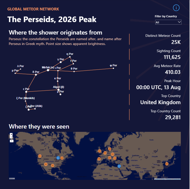
The result is a Power BI dashboard built using data from the Global Meteor Network, which uses a global network of cameras to detect and track meteors. And because looking at meteor data wasn’t enough, I decided to make it more interesting:
- A custom Power Query function pulls the daily trajectory files directly from the Global Meteor Network, so there are no manual downloads.
- A star chart of Perseus, built from scratch in Deneb using right ascension, declination and magnitude data.
- A geographic map showing detected meteors by brightness, so the fireballs stand out from the fainter meteors. I used Icon Pro Map for this one, and I’m still getting my head around it.
- A few measures to bring some basic statistics into the report.
So, if you’d like to explore the data, see how it was built, or even create your own meteor shower dashboard, I’ve shared everything in my latest GitHub repository: perseid-meteor-dashboard
Because if you can’t see the meteor shower, you might as well analyse it.