

After publishing my WCAG Colour Contrast Ratio Checker in Power BI, there was still one thing sitting at the back of my mind: APCA. I first came across it back in 2024, when I properly threw myself into colour accessibility. I even mentioned it in my session “Implementing Alternative Accessible Colours in Power BI Reports” because APCA aligns with human perception in a way the WCAG ratio never quite did.
If you haven’t met it before, APCA stands for the Accessible Perceptual Contrast Algorithm, created by Andrew Somers (Myndex Research). It’s part of the research work going into future readability guidelines.
Why APCA Feels so Different
WCAG’s contrast ratio is simple and neat, but APCA takes things a step closer to how our eyes actually behave on screens. APCA doesn’t treat all colour pairs the same. It cares about:
- whether text is light‑on‑dark or dark‑on‑light
- how thin or bold the text is
- how big the text appears
- how bright colours behave differently in dark mode
- how near‑black colours need special handling
Instead of a ratio like 4.5:1, APCA gives you an Lc value, a signed score that reflects polarity (positive for dark‑on‑light, negative for light‑on‑dark). And instead of a single threshold, readability depends on typography.
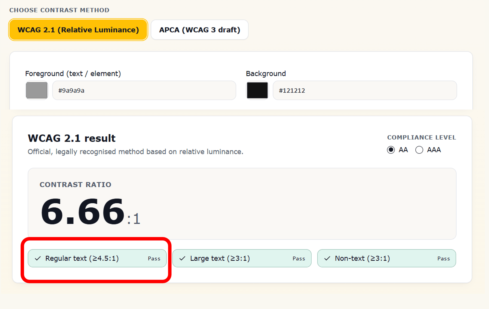
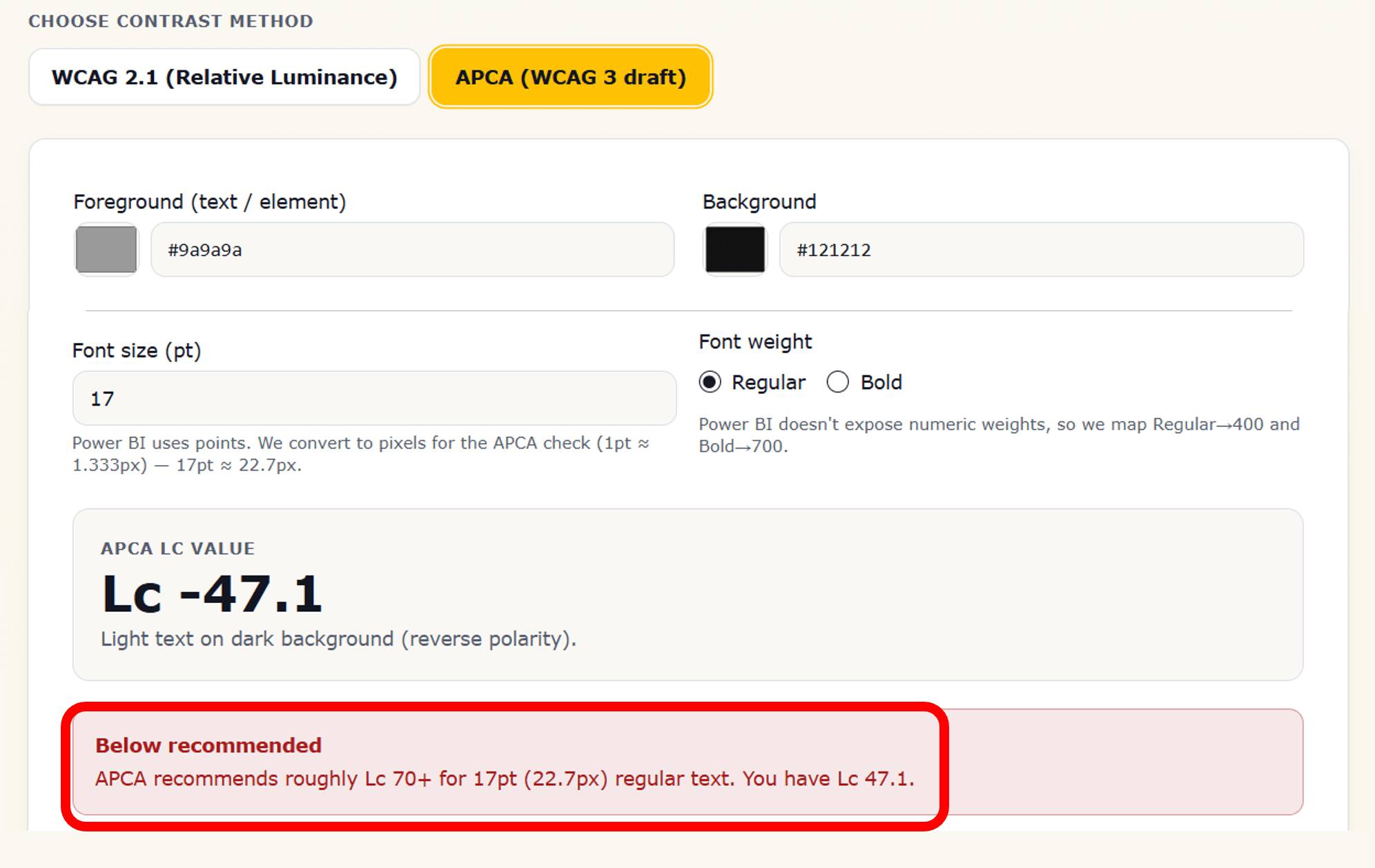
And here’s the part most people don’t expect: A colour combination can pass the WCAG luminance contrast ratio (for example, meeting the 4.5:1 AA requirement) but still fail APCA because the perceptual Lc value is too low for the chosen font size or weight. WCAG sees it as acceptable; APCA sees it as not readable enough. See an example below.
The APCA Maths

At its core, APCA models perceived contrast, not luminance difference:
Where:
- Y_text = perceived luminance of the text
- Y_bg = perceived luminance of the background
- 0.56 & 0.57 = exponents modelling human contrast perception
- S_polarity = scaling factor depending on whether text is lighter or darker than the background
This is the perceptual model I translated into Power BI.
Bringing APCA into Power BI
Once I’d wrapped my head around the maths, I build the APCA_Lc(), a User Defined Function that:
- strips the
#from HEX values and converts them into RGB - normalises RGB values into the 0–1 range
- applies APCA‑style gamma linearisation
- calculates relative luminance using weighted sRGB coefficients
- applies the soft black clamp for near‑black edge cases
- determines text polarity
- applies APCA’s asymmetric perception curves
- returns a signed Lc value
The output is directional:
- Positive Lc → dark text on light background
- Negative Lc → light text on dark background
I validated the structure and constants against the official APCA implementation in the apca-w3 GitHub repository.
To make the checker interactive, I added slicers for:
- Font size (points → CSS pixels)
- Font weight (Regular, Bold, Italic mapped to numeric weights)
Then I created a second measure to determine the required Lc for readability. The pass/fail logic becomes:
IF( ABS(Lc) >= TargetLc, "Pass", "Fail" )
Turning APCA into a Readability Decision
APCA evaluates readability based on context instead of relying on a single universal threshold. It uses Lc targets that change depending on how the text is being used. The decision itself is simple:
- If the magnitude of Lc meets or exceeds the required target for that text style → Pass
- Otherwise → Fail
Polarity matters in the calculation, but the final evaluation is based on absolute contrast strength, not direction.
These Lc targets represent readability expectations rather than compliance rules. As a guide I used:
- Lc 90–100 → small body text
- Lc 75 → standard body copy
- Lc 60–70 → larger text and sub‑headings
- Lc 45–55 → prominent headings
- Lc 30–40 → very large display text
This reflects something designers already understand intuitively: a large report title doesn’t need the same contrast strength as a small KPI label. APCA simply formalises that intuition into measurable thresholds.
Making It Practical: What the Contrast Checker Actually Does
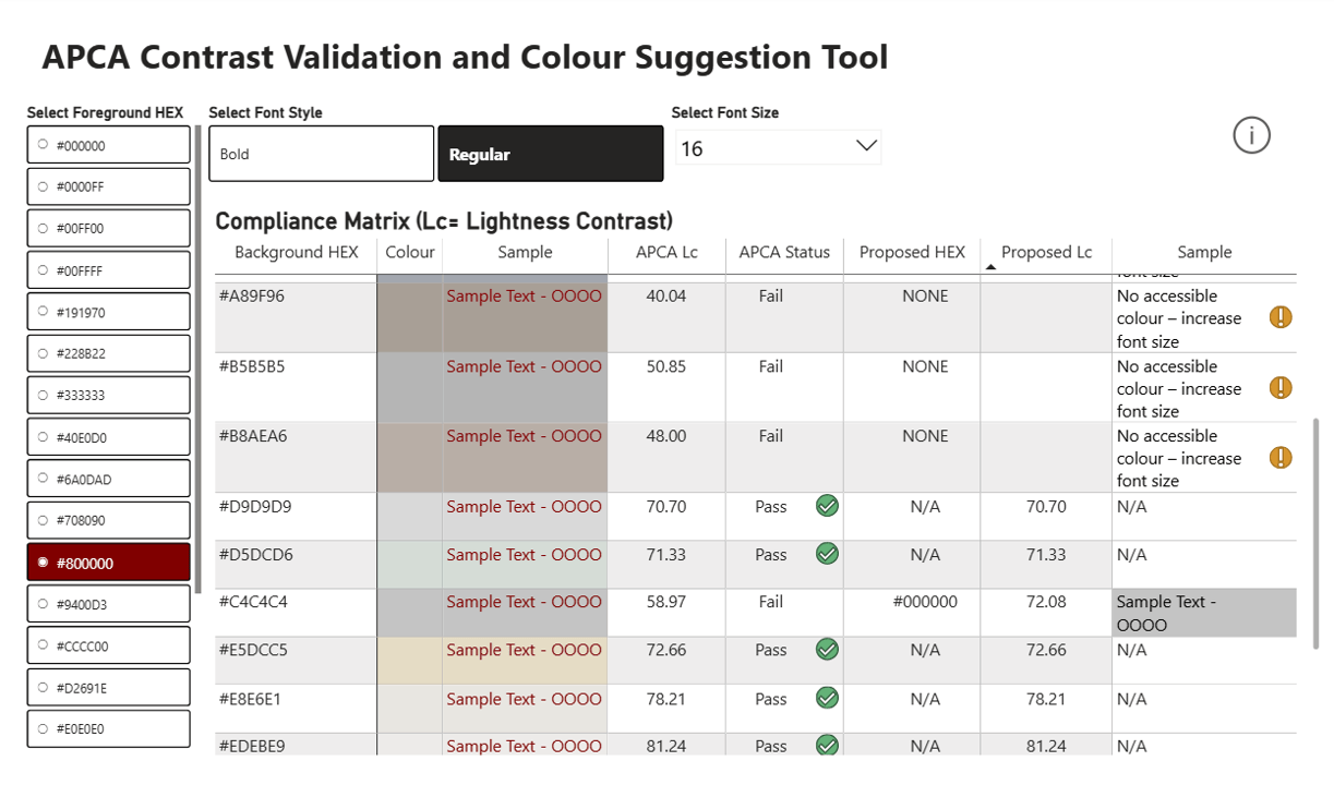
I didn’t want the APCA version to simply throw a “Fail” at people. If a colour combination isn’t readable, the report should help, not stop the conversation. So the checker evaluates your chosen foreground and background colours, calculates the APCA Lc value, compares it against the required minimum Lc for your selected font size and weight, and gives you an instant pass/fail result.
If it fails, Power BI suggests the nearest accessible HEX colour from your palette and shows a preview next to your original choice. And if no colour in the palette can meet the threshold, the tool recommends increasing the font size instead.
Download the Template
To make all of this easier to explore, I’ve made the full Power BI template available to download. It includes the UI, the colour tables, the contrast ratio logic, and everything wired up so you can plug in your own palette straight away. And for anyone who wants to dig into the actual mechanics behind it or reuse the logic in their own models, check out my GitHub APCA Contrast Checker.
Wrap-Up
Using the APCA method feels far more aligned with how we actually see colour. Having it built directly into Power BI means there’s no need to jump out to external tools or make guesses. Instead, Power BI becomes the place where you can experiment with colour combinations, get meaningful feedback instantly, and keep your palette consistent and readable, especially in reports that lean heavily on dark mode.
Thank you for joining me on this journey. Until next time, let’s keep crafting accessible and ethical insights that make a difference!


